
Rich Creative: The Mini Landing Page

Most Meta advertisers are doing the same thing wrong.
They’re pushing traffic to a homepage, and worst of all, a generic contact us form. And then the business owner sits there, staring at a cost-per-click that keeps climbing, wondering why their conversions look like a broken thermostat in winter.
The problem isn’t the audience. It’s the gap between the ad’s promise and the experience that follows.
Enter the mini landing page. Meta’s Rich Creative format has evolved in 2026, and it is something every advertiser running paid social should understand.
What Is a Rich Creative / Mini Landing Page?
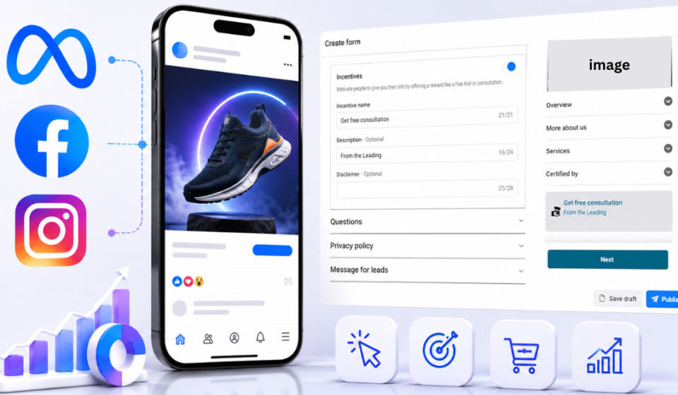
A Rich Creative, in Meta’s ad ecosystem, is essentially an instant-loading, mobile-first micro-experience that lives inside the Facebook or Instagram interface.
Think of it as a landing page that never makes someone leave the app.
When a user taps on your ad, instead of landing in a browser, they get a beautifully formatted, fast-loading mini page within the app that includes a headline, some copy, an image or video, social proof, and a CTA button, all within Meta’s native environment.
Why It Works: The Psychology Is Simple
Every extra step you ask someone to take is an opportunity for them to leave.
Opening a browser. Waiting for a page to load. Getting distracted by a banner ad. Realizing the page wasn’t optimized for mobile. Each one of these friction points bleeds conversions silently, effect meta’s learning, and you’d never know it from looking at your click data alone.
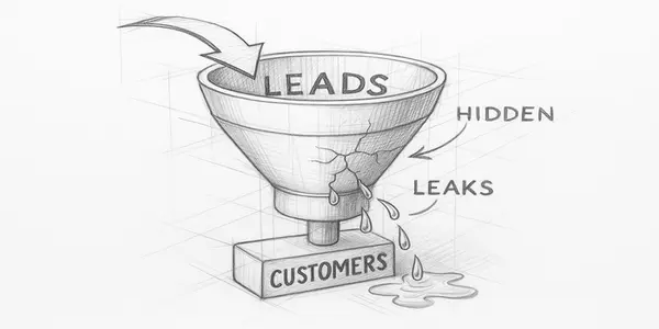
A mini landing page eliminates most of that friction. The user stays warm, stays within the familiar scroll environment of Instagram or Facebook, and gets a curated experience designed entirely around one action.
That single-minded focus is the whole point.
The Difference: Traditional Landing Page vs. Rich Creative
| Traditional Landing Page | Rich Creative (Meta) | |
| Where it lives | External browser / your website | Inside Facebook or Instagram |
| Load speed | 2.5s desktop / 4.6s mobile (avg) | Near-instant / preloaded natively |
| User leaves the app? | Off course | Stays in-platform |
| Mobile experience | Depends on your site optimization | Built for mobile by default |
| Cookie consent/pop-ups | Often yes | None |
| Creative formats | Static page | Video, carousel, single image |
| Visitor’s Data | Both server-side and pixel data | Meta piixel only |
| Best for | Bottom-funnel, high-ticket, retargeting | Top/mid-funnel, lead gen |
| Drop-off risk | High, every second of load time costs you | Low, no app-switch friction |
The table above isn’t about which one is “better.” It’s about understanding that they’re built for different jobs. Using a slow external landing page for a cold mobile audience is the equivalent of making someone fill out a paper form before they’ve even sat down.
The Anatomy of a High-Converting Mini Landing Page
You have roughly 2 seconds to make someone feel like they’re in the right place. Here’s the structure that works:
1. A headline that mirrors the ad creative: If your ad said “Lose 5kg in 30 days,” your mini page headline should say “Lose 5kg in 30 days – Here’s How.” Continuity kills confusion. Confusion kills conversions.
2. One clear value proposition (not three): Resist the urge to list every feature your product has. Pick the one thing your ideal customer cares most about and say it plainly. Then say it again, differently, in the subheadline.
3. A piece of social proof above the fold: A star rating, a quote from a real customer, the number of people who’ve bought, anything that tells the brain “others have done this, and they’re fine.” Trust signals work even when people don’t consciously notice them.
4. A single CTA: The CTA text should describe the action, not the aspiration. “Get My Free Quote” beats “Transform Your Life” every single time.
What Makes It “Rich”?
The most comprehensive benchmark available comes from Unbounce’s analysis of 41,000 landing pages and 464 million visitors. The median landing page conversion rate across all industries was 6.6% in Q4 2024, with paid social traffic specifically converting at around 12%, higher than paid search at 10.9%.
The average bounce rate for landing pages sits between 60–90%, and 53% of mobile users abandon sites that take over 3 seconds to load, eliminating the conversion opportunity entirely before the visitor even sees the page.
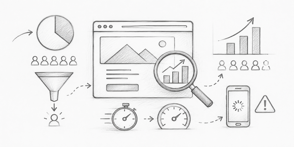
On mobile, where the majority of Meta ad traffic lands, the situation gets worse: from a 1-second to 6-second page load time, the probability of a bounce increases by 106%. A one-second delay in page response can cause a 7% reduction in conversions.
So when your Meta ad sends a mobile user to an external page, you’re betting that your site is fast enough and clean enough to survive the transition. For most advertisers, it isn’t.
Source: Unbounce Conversion Benchmark Report | Sender Landing Page Statistics 2026
When Should You Use a Mini Landing Page vs. a Full Website?
Use a rich creative when:
- Your campaign has a single, specific offer (a discount, a free trial, a lead magnet)
- Your audience is primarily mobile
- You’re running top-of-funnel or mid-funnel awareness campaigns
- Your website is slow, old, or not mobile-optimized
Stick with your full website when:
- The purchase decision requires extensive research (high-ticket items)
- You need to retarget pixel data from your own domain
- You’re running bottom-of-funnel campaigns to warm, already-interested audiences
The Bottom Line
If you’re spending money on Meta ads and sending traffic to a generic page, you’re essentially pouring water into a leaky bucket and measuring how much you poured in, not how much stayed.
The mini landing page isn’t magic. But it removes enough friction, adds enough continuity, and creates enough focus that the conversion math simply starts working better.
Build the experience around one person, one problem, one action.
Everything else is noise.
Enjoyed this? Follow Knowledge Moniker for weekly breakdowns on digital marketing, business, and the ideas worth thinking about.